Hi Everyone!
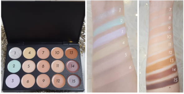
Back when I bought the Winterberry Palette from Coastal Scents (read my full review), I also bought the Eclipse Palette (a cream concealer palette). It comes with fifteen shades: white/silver, mint green, pale yellow, lavender, and 11 skin-coloured shades (pale to dark).

Coastal Scents Eclipse Palette
We’ve got you covered—literally. Neutralize under eye halos, conceal blemishes, banish breakouts, and reduce redness with fifteen cream-based shades. Designed to conceal, highlight, and custom blend to your skin tone, watch your flaws disappear.
The mint green shade counteracts redness or pinkness caused from rosacea, blemishes, or capillaries around the nose and cheek areas.
The pale yellow shade conceals black, blue, or purple imperfections such as bruises or unsightly under eye halos.
The lavender shade neutralizes areas with excessive yellow pigmentation and corrects olive skin tones.
The white/silver shade can be used as a highlighter to add sheen to cheekbones, nose and eyes.
I’ve tried applying these concealers with a brush and with my fingers. I find the best way is to use my fingers or apply with the brush, but then blend out with fingers. Using a brush requires a little more effort to blend in, and this isn’t exactly ideal for your under eyes. With the warmth of my finger, the cream blends out smoothly. I’ve been using either the hydrating or smoothing primer from Make Up For Ever under these concealers. To apply, I use my ring finger and swirl it in the concealer, then lightly dab it onto my face.
How I Use the Shades
I got the palette mostly to try the green and lavender shades. I’ve tried the green corrector from NYX, but the green is a bit too pale (I’ve swatched it next to the Urban Decay one- see here). I haven’t used the pale yellow too much. The green has been covering up redness really well. I’ve been using the lavender for under eyes to cover up dark circles, although I should test out the yellow for under eyes too.
For any colour-correcting concealer, you don’t blend it in all the way. You blend it just enough so that the colour is spread evenly, but you still want to see the purple, yellow or green. If you blend it all the way, then whatever you’re trying to cover up won’t be covered!
I was testing out the shades to see which would match my face and Shade 11 is pretty close. I could probably mix it with one of the others.
I’ve tried Shades 6 and 7 under my eyes, but I prefer using a more fluid concealer instead of a cream-based concealer to avoid cakey under eyes (especially when I might already be using the lavender one).
I’ve been using Shade 14 and 15 for contour. A small amount goes a long way, so I do a very thin line. I like to use my finger. When I contour my nose, I use a concealer brush to apply so it’s more precise, but then use my ring finger to blend out.
I don’t really use the other skin-coloured shades since they’re not a good match, but I could probably use them as cream eyeshadows or something.
At first, I didn’t really know what to do with the white/silver shade. I tried it as a highlight, but since it’s cream, it’s hard to blend out nicely without accidentally taking off your other makeup. Since the lavender, green and yellow shades are used for underneath your makeup, I thought I would try the white/silver one UNDER my foundation. I applied it to my cheeks where I would apply highlighter and blended it in. I didn’t blend it in all the way- similar to the colour-correcting shades, I blended just enough so that I looked like I was going to put on some galactic makeup. I applied my foundation on top of it and it leaves you with glowy, but natural look. It’s perfect for the day time when you don’t want to apply the most poppin’ highlighter you have, but just want a subtle glow and dewiness.
Another way to use the white/silver shade is to apply it under eyeshadow. It made my metallic eyeshadows go from beautiful to gorgeous! It’s like a primer that makes your shadow so metallic that it gives it that wet look.

RATING: 4/5
I really like this palette. I wish I could pick and choose the shades I wanted, but for less than $10, you can’t go wrong. I read reviews on the Eclipse Palette and a lot of people had problems with it blending well or looking cakey. I think you need a really good base (I always use a moisturizing or smoothing primer) and the best way to apply is with your fingers. Also, since this is a cream concealer, if you have any dry patches, they will show. So, unfortunately, your skin can’t be too dry or the concealer will emphasize the dryness.
I definitely want to try higher end cream concealer palettes or even drugstore ones because I don’t love that this palette was Made in China (which I didn’t know when purchasing). Check out my blog post- Where Were Your Beauty Products Made?
Also, since I’m Canadian, ordering from Coastal Scents costs a lot of money because they charge shipping, so I’d prefer something where I don’t pay more for shipping than the product.
Have you tried cream concealers/colour correcting concealers? What are your faves?
Love,